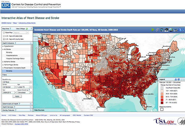
Description of Map and Health Data it Represents
The Centre for Disease Control (CDC) developed the chosen GIS map as an interactive atlas showing the incidence of avoidable heart disease and stroke in America. It did so by highlighting the death rates per 100,000 people. The data cut across all races and genders, starting from the year 2008 and ending in 2010 (GIS Inc., 2013). Holistically, the map showed that the incidence of health conditions was more concentrated in the South than in any other part of America. This finding meant that deaths associated with heart disease were related to zip codes as opposed to a genetic predisposition to the disease. According to GIS Inc. (2013), the map showed that out of the 800,000 reported deaths associated with heart disease and stroke, a quarter of them could have been prevented. In other words, making improvements in lifestyles could have helped people live longer. The diagram below shows the GIS map.
Figure 1: GIS Map 1
Critique of the Map showing its Strengths and Weaknesses
The map highlighted above is advanced because of its interactive nature. Indeed, it allows users to zoom into different geographical locations and analyze state and county data respectively. It is also more detailed than most GIS maps because it shows up to five different health indicators that have smaller subgroups. Concisely by evaluating these different types of information, observers could understand different health data relating to different types of health issues, such as heart disease, coronary heart disease, and acute myocardial infarction. With such information abound, the map also allows users to further filter the health information using different demographic data, such as race, gender, age, or year. The map goes a step further to give users detailed information about the health data by allowing them to gain access to the information, based on the socioeconomic determinants of health, such as social and physical environment, which are highlighted on the map. Lastly, the map is superior because it has different animation characteristics that are based on a custom-configuration schema, which allows for easy updating and maintenance (GIS Inc., 2013). This feature makes it easy for health experts to understand the incidence and prevalence of heart disease and stroke in selected regions of the country.
Although the GIS map is advanced because of its vast features, it appears complex and technical for a nonprofessional to understand its contents. Stated differently, the map appears technical and useful only for big data analytical experts. Therefore, based on its complexity, the map requires technical inputs to understand how different health analytical data relate to one another. Another weakness of the map is its relatively small nature. This makes it difficult for users who cannot see small prints to view all the information contained in them.
Critique of Different Map
The GIS map below shows the incidence of HIV/AIDS in India. It demonstrates that the incidence of the disease is mostly concentrated in six Indian states found in the south.
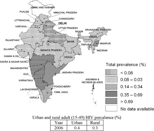
One of the greatest strengths of the map is its ability to provide a nationwide analysis of HIV/AIDS prevalence in India. This feature is often called “locator map advantages” (Huxley College, 2016) because it allows users to locate where the highest and lowest incidences of HIV/AIDS are on a nationwide scale. The presence of a legend showing the prevalence of HIV, viz-a-viz the color schemes provided, is also another strength of the GIS map because it helps users to understand differences in health outcomes across varied states in India. However, one weakness of the map is the difficulty in distinguishing the differences in shading across closely related color schemes. For example, it is easy to confuse the location of total prevalence rates under 0.08% and those between 0.35%-0.69% because the shadings are closely related. The developers could have used bold colors to show these differences.
Additional Insights
GIS maps could be useful in various aspects of health management. As shown from the examples above, such tools are useful in providing a detailed analysis of health data, which could be contextualized within national or state analysis. This way, it is easy to understand correlations with other aspects of health data. However, I believe that such maps should be simple to understand because they are a simple abstraction of reality. The involvement of complex and technical analytical tools, such as the ones employed in our first GIS map limits the type of audience that could understand the information contained in the map (Ankersen & Richardson, 2014). By extension, we find that the information conveyed in the map is only useful at high levels of technical analysis. It is unlike the second map, which is simple to understand. Similarly, health practitioners at different levels of care delivery can understand it.
References
Ankersen, R., & Richardson, K. (2014). Helping hearts: Interactive atlas deciphers where heart attacks and strokes occur and who is at risk. Web.
GIS Inc. (2013). An overview of the interactive atlas of heart disease and stroke. Web.
Huxley College. (2016). What all good maps should have. Web.
Kandwal, E., Garg, P.K., & Garg, R.D. (2009). Health GIS and HIV/AIDS studies: Perspective and retrospective. Journal of Biomedical Informatics, 42(4), 748–755.