Pareto Chart
A Pareto chart is a form of a pie chart used to identify areas that require attention and priority in process improvement. In healthcare, Pareto Charts help identify the most frequent outcome of a categorical variable that establishes the root of a healthcare problem. The chart displays ordered frequency counts for diverse levels of categorical and nominal variables. Figure 1 below is a Pareto chart that presents the data regarding patients’ health complaints at ESKCC medical clinic.

From the results shown in the chart above, it can be concluded that most patients in the facility complain of too long waiting time. Moreover, a significant population also complains of the medical center taking too long to find the individual’s medical records. Over 400 patients complained of long waiting times, while over three hundred patients complained of the facility taking too much time to retrieve their records. The two cases (type 2 and type 6) account for 50% of the recorded complaints. The complaints arise due to the slow and lengthy processes involved before receiving healthcare services. Immediately they enter the facility, patients visit the reception and spend some time waiting for confirmation that their details already exist in their database. Patients visiting the facility for the first time further spend more time filling in the information required to update their details in the medical database.
Afterwards, patients spend some time lining up before being attended to by the physician. They also wait for the examination room’s availability, whereby the nurse records patient complaints. After seeing the physician, patients spend some time back at the receptionist while waiting for their bills to be generated. Patients using insurance are directed to the insurance department, whereby their issues take time before being resolved. Sometimes, the insurance issues may make patients spend additional time waiting for the problems to be solved since the insurance company may pay the bills partially or fully fail to pay. When patients have a history of failing to pay bills, they are required to go back to the reception and pay via cash. In general, the processes involved right from when the patient enters the facility to when they leave are tiresome and time-consuming.
Control chart for the waiting-time complaint.
A control chart is a graphical data representation technique that studies how a process changes over time. Control charts are made up of the average line, the upper line which indicates the upper control limit, and lower line representing the lower control limit. The data line represents data filed by the complainants. These lines derived from the patients’ historical data are helpful when concluding whether the process variation is predictable or not. Generally, control lines are used when predicting the expected range of a process results, analyzing the stability of a process, and determining the next course of action. They establish whether the quality improvement project would seek to prevent the existing problems from occurring again or make significant changes to the process.
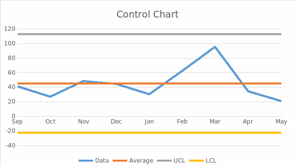
Control limits determine if a process variation is caused by a random cause or a particular issue. Variations within the control limits occur by chance, whereas variations outside the control units result from particular causes. The upper and lower limits act as boundaries for the expected process deviation. The control limits are calculated as shown below.
The upper control limit: UCL = x – (-L * σ)
The lower control limit formula: LCL = x – (L * σ)
where:
- x – mean value of the control processes
- σ – standard deviation of the processes; and
- L – the dispersion of sigma lines from the average value of the control.
Typically, the default calculator value is used when calculating the control limits and is estimated to be three sigmas.
When calculating the mean, the sum of the entries is divided by the number of entries. Similarly, when calculating the standard deviation, the mean values are first calculated before squaring the value of the distance of each data point to the mean. The values are then summed before being divided by the number of entries, and finding the square root. Generally, mean is calculated using the formula Mean = {Sum of Observation} ÷ {Total numbers of Observations}.
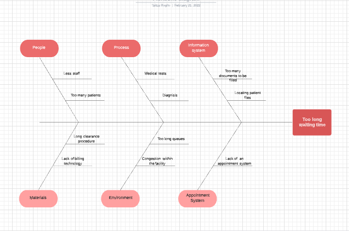
Fish Bone Diagram
Flow Chart Process
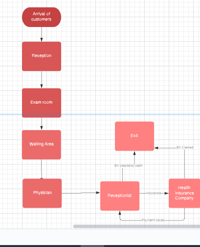
Based on the flow chart above, there are too many procedures involved before the patient is served. The lengthy processes involved directly affect patients since they spend too much time each cycle. Moreover, the payment structure of the facility introduces unnecessary complexity. The health insurance sector should be placed together with the reception, and patients should first confirm the method they will use to pay for the services offered. This will help the facility avoid complications from patients who intend to use insurance but have bad credit history and unpaid bills.
Improvements to Streamline the Patient Process
The total quality management concepts require that healthcare facilities prevent clinical problems that reduce patient satisfaction and continuously improve organizational processes and better healthcare services. The central ideas of comprehensive quality management focus on patient safety, the effectiveness of adopted methods, efficiency, and timeliness. The three significant recommendations that can streamline the patient process include using a patient portal, adopting a queuing app, and offering telemedicine.
A patient portal is a secure online platform that allows patients to access personal health data from any healthcare facility provided they are connected to the internet (Beal et al., 2021). Patients are only required to have a user name with a unique password. Then they can log in to see doctor schedules, register for services, make appointments, improve communication with the healthcare experts, and optimize medical office workflow. An online portal makes service delivery more efficient since patients need not queue for long hours. Furthermore, patients can request referrals, appointments, and even prescriptions increase efficiency among the staff since it allows them to attend to patients in critical conditions.
Moreover, a queuing app helps reduce the average waiting time. It streamlines the customer flow since it allows customers to join queues virtually before even arriving at the healthcare facility. The system will enable customers to wait remotely without being confined to a particular waiting bay. This allows them to have ample time doing other activities while waiting for their turn. The technique is effective since it controls physical lines and reduces waiting periods. Lastly, telemedicine can help reduce the long queue by allowing physicians to attend to patients and communicate without necessarily being in the same room. Physicians can use technology such as phones, chats, or texts to communicate with patients and solve their issues remotely. This technique allows for better care management and improves patient satisfaction since it facilitates quality services at reduced costs.
Source
Beal, L. L., Kolman, J. M., Jones, S. L., Khleif, A., & Menser, T. (2021). Quantifying Patient Portal Use: Systematic Review of Utilization Metrics. Journal of Medical Internet Research, 23(2), e23493.